Free Strategy Radar Spider Chart Excel Template
Download our free Strategy Radar Spider Chart Excel Template to visualize and compare risks, performance, and more for strategic insights.
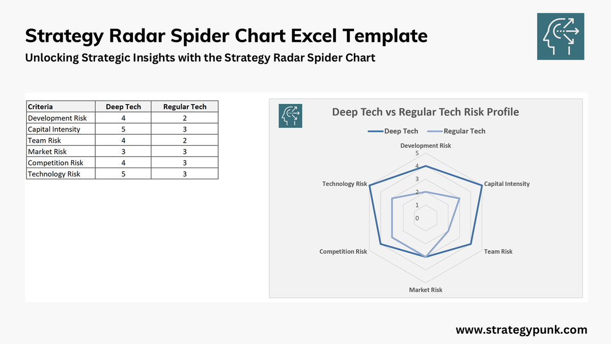
Unlocking Strategic Insights with the Free Strategy Radar Spider Chart Excel Template
Clear strategic insights and visual representations are essential for effective decision-making.
Whether you analyze market risks, compare product features, assess team performance, or visualize competitive positioning, the Radar (Spider) Chart offers a powerful way to see multiple factors at a glance.
That's where our Free Strategy Radar Spider Chart Excel Template comes in – designed to help business leaders, strategists, and analysts transform complex data into actionable insights.
What is a Radar (Spider) Chart?
A Radar Chart (also known as a Spider Chart or Web Chart) is a data visualization tool that displays multiple variables on a two-dimensional plane, resembling a spider's web.
Each axis in the chart represents a different variable, with points plotted along each axis according to their values.
When connected, these points form a shape that provides a visual summary of the data across the different variables, making it easy to compare profiles and highlight differences.
The Radar Chart is handy for visualizing the strengths and weaknesses of different strategies, teams, products, or projects in one compact and intuitive graphic.
Introducing the Free Strategy Radar Spider Chart Excel Template
Our Free Strategy Radar Spider Chart Excel Template is a ready-to-use Excel tool for quickly creating Radar Charts tailored to strategic needs.
The customizable template allows you to enter data, adjust labels, and set scales, making it ideal for any strategic analysis.
This tool is handy for corporate strategists, consultants, project managers, product teams, and executives seeking a straightforward yet effective way to visualize and compare strategic insights.
Key Features of the Template
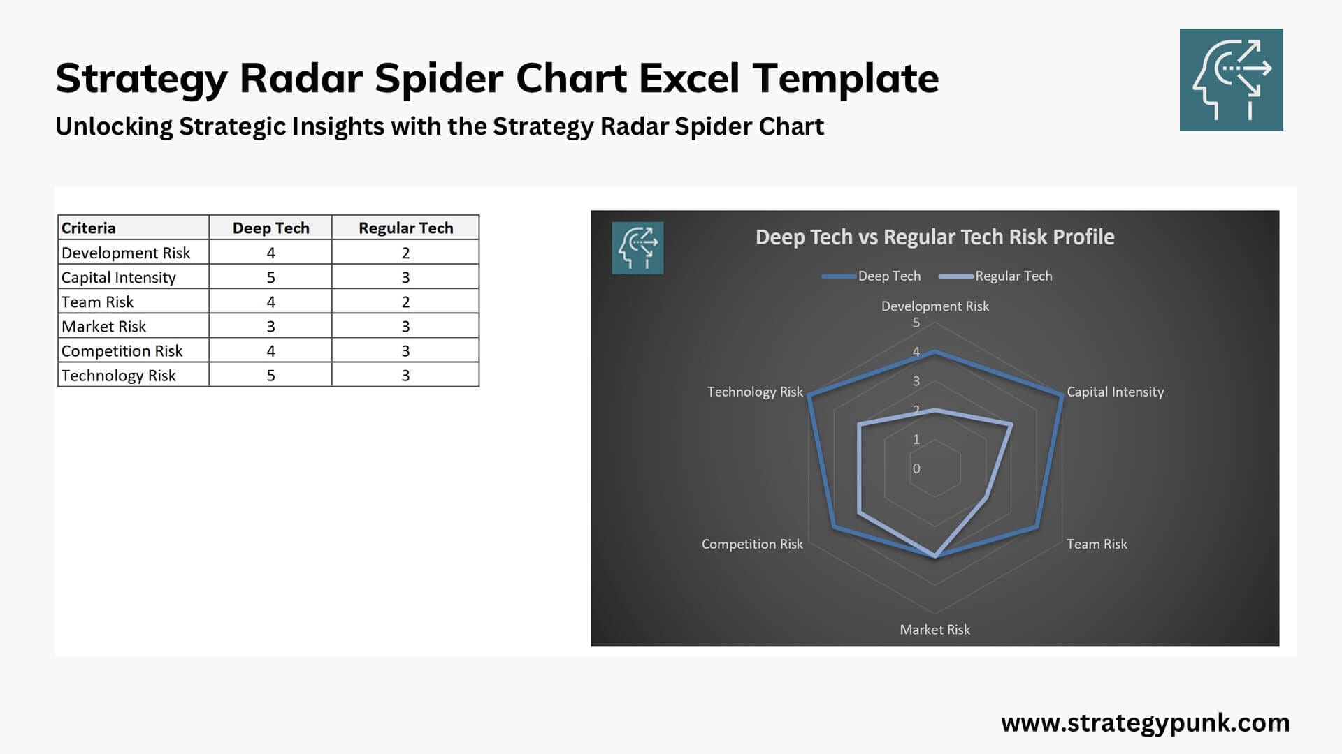
The Free Strategy Radar Spider Chart Excel Template comes with several key features designed to provide flexibility and ease of use:
- Customizable Axes and Labels
Each axis on the chart can be labeled to represent specific variables relevant to your strategy or analysis. For example, if you’re comparing product features, you might label the axes as "Performance," "Cost," "User Satisfaction," etc. - Flexible Data Input
The template is designed for easy data input. Simply enter your values for each variable in the pre-set cells, and the chart will automatically update to reflect your data. - Adjustable Scales
Each axis can be set to a customized scale, allowing you to represent data according to your specific needs. The template can be adjusted to fit whether you’re working with ratings out of 5, percentages, or other metrics. - Multiple Data Series
The template supports multiple data series, enabling you to compare different entities (e.g., multiple products, teams, or strategies) in a single chart. Each data series is color-coded for easy identification. - User-Friendly Design
The template includes instructions and tips to help you maximize the Radar Chart. It’s designed to be accessible for all experience levels, from beginners to advanced Excel users.
Practical Applications of the Strategy Radar Spider Chart Template
Here are some practical applications of this template to illustrate how it can be used for strategic insights in various contexts:
1. Competitive Analysis
Use the Radar Chart to compare your company’s product or service against competitors. By plotting key factors such as "Price," "Quality," "Customer Satisfaction," "Innovation," and "Brand Loyalty," you can easily see where your product excels and where improvements may be needed. The shape of the web will highlight strengths and weaknesses, helping you make data-driven decisions to stay competitive.
2. Risk Assessment
The Radar Chart is a powerful tool for visualizing risk profiles. For instance, if you’re assessing a new technology’s potential for adoption, you could set up axes for "Market Risk," "Development Risk," "Capital Intensity," "Competition Risk," and "Technology Risk." Plotting these risks gives you a clearer picture of areas needing mitigation or further research.
3. Team Performance Evaluation
This tool can assist managers and HR professionals in evaluating team or employee performance across multiple metrics. You could track "Communication," "Technical Skills," "Leadership," "Time Management," and "Adaptability." The visual output provides a quick overview of strengths and development needs, aiding in performance reviews and professional development plans.
4. Product Feature Comparison
If you’re in product management, you can use the Radar Chart to compare multiple products or features based on factors such as "User Experience," "Reliability," "Performance," "Design," and "Cost Efficiency." This visualization can help identify which product aspects align with customer needs and which need improvement.
5. Strategic Goal Tracking
The Radar Chart can help track progress across various strategic objectives in strategic planning. For example, if your goals are related to "Market Penetration," "Revenue Growth," "Customer Satisfaction," "Operational Efficiency," and "Employee Engagement," this chart can provide a snapshot of where you stand in each area and where to focus efforts.
How to Use the Free Strategy Radar Spider Chart Excel Template
Using the template is simple, and no advanced Excel skills are required. Here’s a quick guide to get you started:
- Download and Open the Template
Begin by downloading the free template and opening it in Excel. You’ll see pre-set cells for data input and an embedded Radar Chart. - Define Your Variables
Label each axis with the variables you want to measure. For example, if you’re analyzing market entry strategies, you might label the axes as "Market Potential," "Competitive Landscape," "Regulatory Barriers," "Cost," and "Time to Market." - Enter Data for Each Variable
Input your values for each variable in the data table. If you’re comparing multiple entities, enter a separate row of values for each one. - Adjust Scales as Needed
Customize the scales of each axis to match the nature of your data. If all variables are on a scale of 1 to 5, ensure that each axis reflects this range for consistency and readability. - Customize the Chart Design
Excel allows you to customize the chart design, so feel free to adjust colors, line styles, and other visual elements to fit your presentation style. - Interpret the Results
Analyze the shape and size of the web created by the connected data points. Larger shapes generally indicate stronger performance or higher values in those areas. By comparing the shapes of different data series, you can quickly identify strengths, weaknesses, and areas for strategic focus.
Benefits of Using the Radar Chart in Strategy Development
The Radar Chart is more than just a visual tool – it’s a strategic asset. Here are some reasons why this chart is invaluable for strategy development:
- Easy Comparisons: Radar Charts simplify comparing multiple entities side-by-side in a single graphic.
- Holistic View: Plotting multiple variables gives you a comprehensive view of the strengths and weaknesses across a set of criteria.
- Intuitive Insights: The unique shape of the chart allows you to see patterns and anomalies that might not be as obvious in a table or list format.
- Engaging Presentations: Radar Charts are visually appealing, easy to understand, and perfect for communicating complex data to stakeholders.
Final Thoughts
The Free Strategy Radar Spider Chart Excel Template offers an easy and effective way to harness the power of Radar Charts in strategic planning and analysis.
Whether you’re conducting a competitive analysis, assessing risks, or evaluating team performance, this template provides a straightforward path to valuable insights. Best of all, it’s completely free, so you can start exploring the benefits of Radar Charts today.
Visual tools like the Radar Chart simplify complex data, making it easier for stakeholders to understand and engage with strategic insights.


